For me, a ‘modal interaction’ is one that facilities a single, focused type of interplay between human and computer. It’s a moment where you’re doing just one thing, without any distraction.
As soon as you use the word ‘modal’, you might start thinking of ‘modal dialogues’ or ‘modal windows’ – which ask the user a quick question in a popover of some kind. Often you get two buttons to choose from (like: “Yes, OK” and “No thanks, not now”). But I think a ‘modal interaction’ can be more than that. For me, at least…
Modal interactions are designs that enable focus on a single interaction type
This means removing a lot of choices and optimising a space for that one activity. We anticipate a stripped down set of needs. We provide an environment that’s tailor-made to that particular mental space and no others.
Let’s look at some examples.
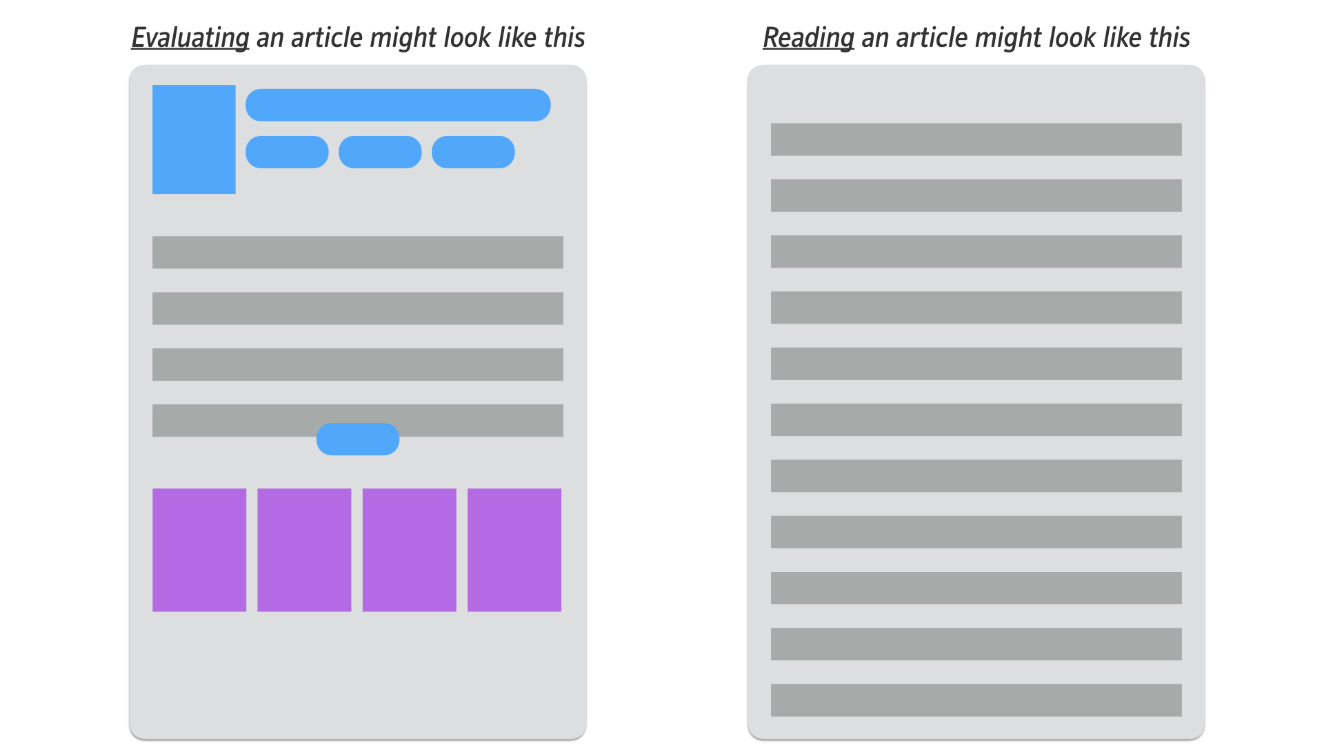
Evaluating vs reading modes

A page-layout that allows you to evaluate an article (on the left), might also support other interaction modes (such as ‘Browsing’, ‘Research Gathering’ or ‘Checking’…). Meanwhile, a page-layout optimised for reading the article would probably only support that activity.
The design on the left provides all the data you would need to understand the article in a variety of contexts (title, author, date and other meta data – followed by the first para or so – then a link to read more – then links to other similar articles). There are lots of choices available which make the page work well in multiple contexts.
‘Evaluating’ is a far less linear process than ‘Reading’. Most users prefer the freedom to dart around the page, taking in the bits of data that are important to them. They are combining separate pieces of information together in order to make their assessment on whether the article is worth reading or not.
We might imagine that if the user selects a ‘read more’ link, they are signaling their desire to shift into ‘reading mode’ – the design on the right, where all metadata, links and recommended articles are removed in favour of nice big text.
Sorting vs composing modes

In this example, we can see a similar contrast in the amount of choices that are suitable to a ‘sorting’ experience vs a ‘composing’ experience.
The layout on the left allows you to scan through an email at a time. There are lots of controls at the top of the window, that would help you to search, to apply various filters and sorting orders etc. Meanwhile, the layout on the left makes all that unavailable, whilst email composition is underway.
Investigating vs retrieving modes

Imagine you deal with complaints as part of your job. You have a case management system that allows you to retrieve cases and then to investigate them.
Unlike the other two examples, I’m imagining here that you move from a focused linear mode (retrieving) to free browsing / non-linear mode (investigating). As such, you start with a simple screen – where nothing can happen except for a search. You later move into viewing all facets of a particular complaint (details, history, the actions taken, etc). Here you’d also want the freedom to move around as you see fit. Each piece of data would be a clue leading you to others, until you managed to build up a full picture of the complaint.
Attributes of a great modal interaction
With those three examples in mind, let’s think about the qualities we should look out for in a modal interaction. Here’s a first stab:
Modal interactions should:
- Be focused steps for a single task
- Minimise options (that distract from the task)
- Be easy to exit safely
- Be easy to resume activity before modal moment
- Stay flat (a sequence of screens shouldn’t have a hierarchy)
- Not be nested (no modal within modals)
- Be kept simple (not too many templates)
- Be triggered by the user or be a welcome intervention
- Be rarely used (users prefer freedom most of the time – though perhaps this is changing slowly as our algorithms improve – more on this below)
- Feature layouts and transition styles that aide awareness of the temporary context shift
- Be easy to complete without access to rest of system
- Conclude with showing the effects of the user’s action back in the non-modal world
When to trigger a modal moment on behalf of the user?
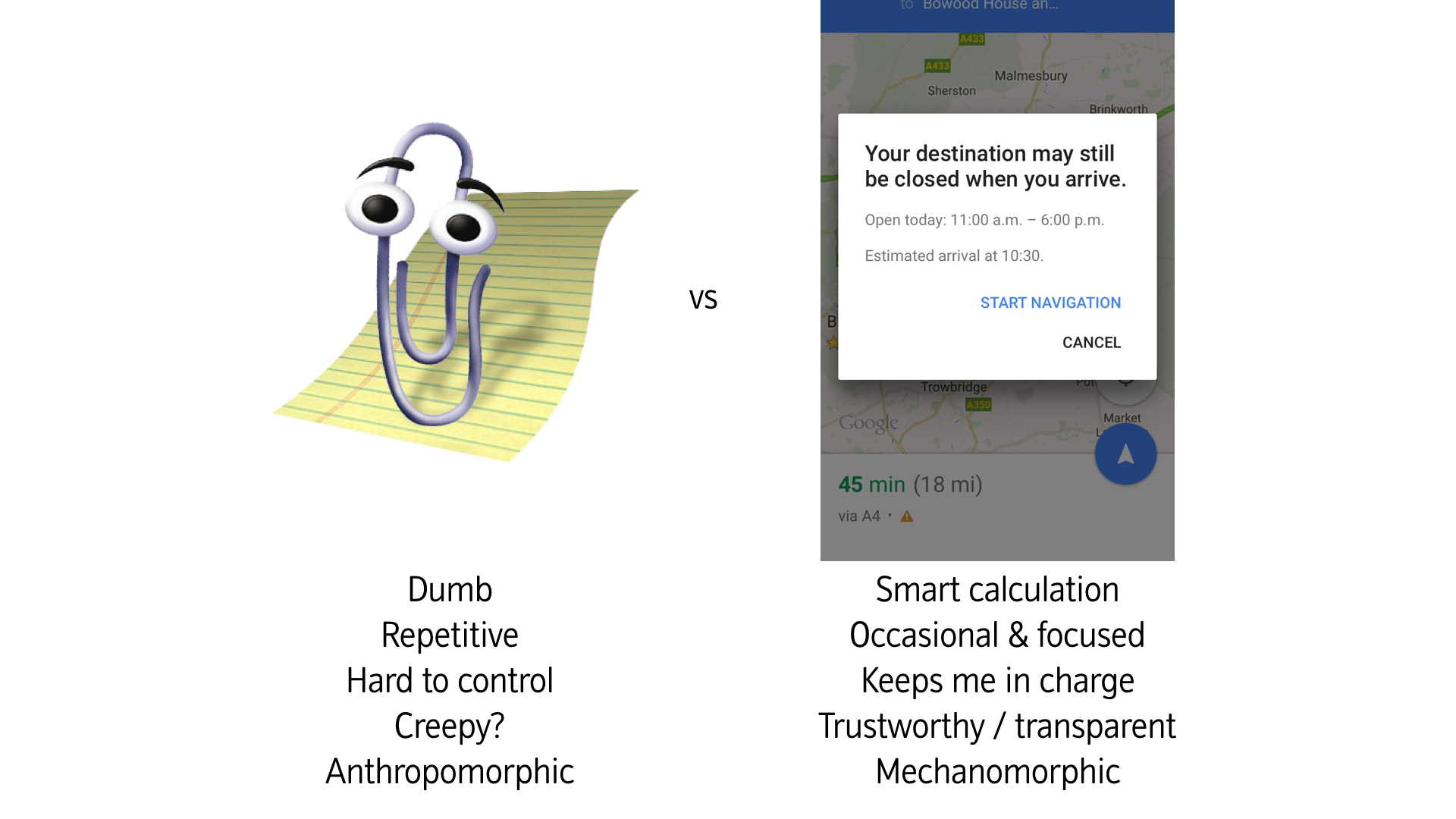
I suspect the answer to this is still – very occasionally. Though things are certainly progressing (just contrast Clippy’s attempt to help with the much more recent inventions of Google Maps – see example below).
Even in cases where the technology is available, users may still be slow to welcome too much intervention from our AI friends (unless the value exchange for the interruption is really high).

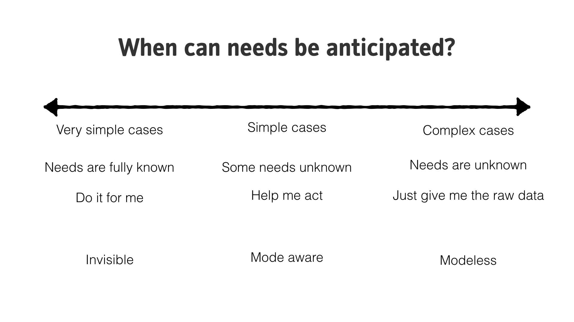
Much of what we provide users with still has to cater for lots of possible variation in terms of context and need. There is often no better tool for coping with that complexity than the human brain.

Naturally this depends on how we define ‘complexity’. Computers are brilliant (and getting better) at handling some types of complexity, while humans are better at others. The key things for now, might be to remember that modeless design is still where most of the action is – unless the user explicitly tells us that they want to shift modes.
