Digital design is about place-making. The creation, maintenance, optimisation, de-commissioning… of spaces in the digital realm.
Sometimes these places are just amazing. Usable and useful – yes! But more than that. They can feel like they bring out the very best in us.
Just like with architecture of real world spaces, digital design creates spaces for humans to live, to work, to play together online.
But when we have the rigour of architecture! Considerations and processes around safety, privacy, permissions, environment, sustainability… To care like architects. About the surroundings – we don’t want a blot on the landscape. About flows in and around the spaces we create – we want it to make sense. To help folks to flourish and be happy.
We can want these things for digital. But it is still rare to find them happening. It’s therefore really important to celebrate the moments where it happens.
Just such a moment has happened recently with the birth of a new email platform from the makers of Basecamp: [Hey](https://hey.com).
Let’s look a few of the new places they’ve created. In no particular order…
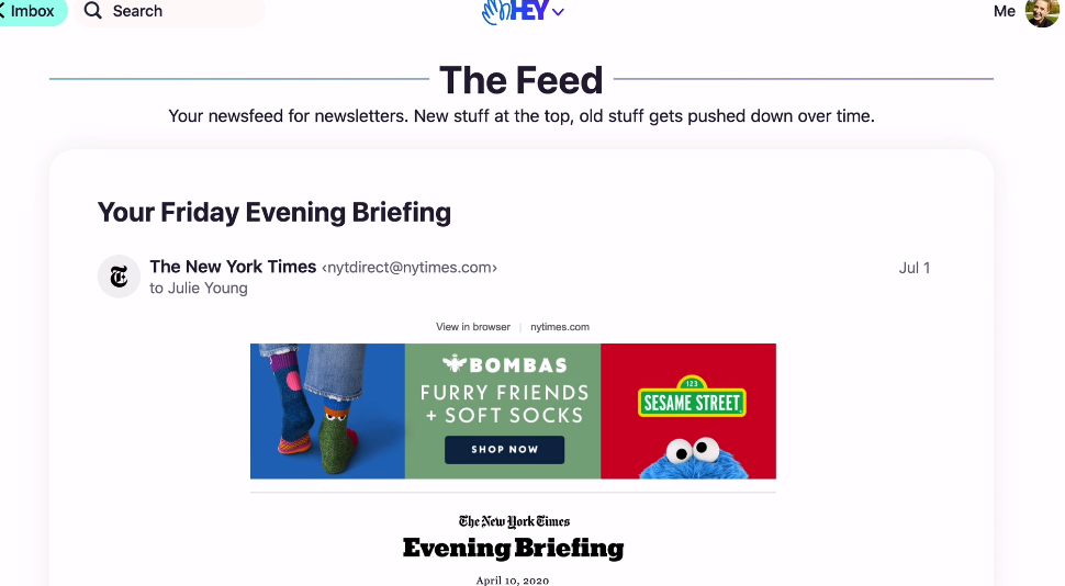
The Feed
This is a place for your newsletters. It’s a bit like RSS used to be. You’d go there occasionally, with a desire to leaf through and see what grabs you. To keep up with what’s happening. To discover new things from organisations / publications you care about.
The key thing is that it’s tucked away – all in one place – and not in amongst your other types of email.
Go there when you’re in the mood to browse and be fed.
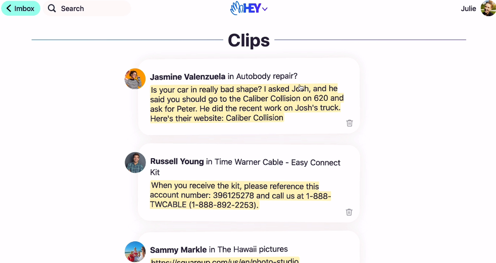
Clips
This is a place for snippets of content that you need to return to. It doesn’t make you delve through the whole email again. Nice!
Popping things here and getting rid of them again – is easy peasy.
This is the sort of design idea that works perfectly with the grain of life. They spotted people saving emails for the purpose of going back to particular details – and thought ‘we can make that easier!’
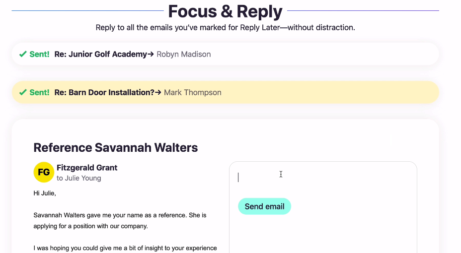
Focus & reply
On Hey, you can mark emails that you want to reply to later – in itself a kindness. Saving you the burden on memory – or from a hack (like marking the email as unread!). And when you have time and space to reply to emails, you can do them all at once in this ‘Focus & Replay’ space.
I love this interface! Why? The ability to see the email your replying to side-by-side with the response you’re drafting. It makes for a more comprehensive and thought through correspondence. Plus it’s nice to get that visual reward of stacking them up and bashing them out. Take that email!
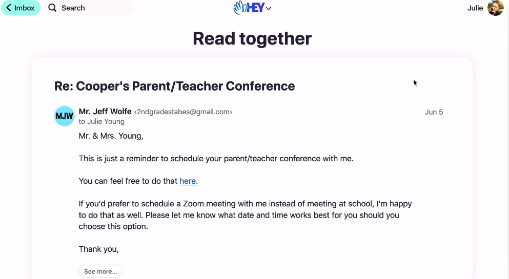
Read together
This one is so simple. Strip everything else away – and let me read these! You get to choose which ones you want to select for this – you can even combine related threads and/or rename the threads as you make sense of the information that’s coming your way. It’s humane. It’s respectful. It’s a tool that helps tame the noise – rather than adds to it.
Files
Another genius touch. This is a place for re-finding files. Imagine not having to search through email threads for a particular file. They did! And they build something that helps you never have to do that again.

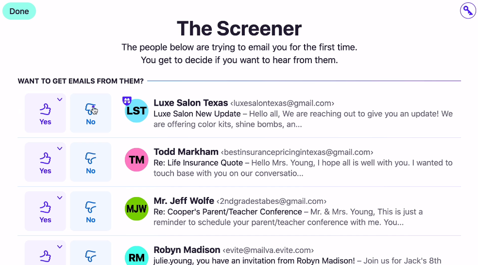
The Screener
Unfortunately we live in world where folks will try to grab your attention as much as they can. Keeping control on that attention, being able to direct your focus – takes discipline, self control or productivity hacks. But imagine having a tool that helps you with this!
The Screener offers you a chance to decide where to put emails by default – into your imbox (sp!), your feed, your papertrail (another amazing place – for your receipts and paperwork).
