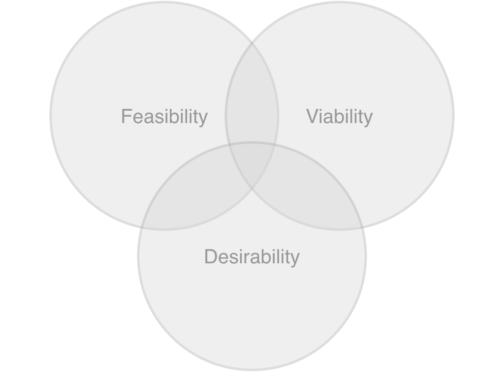
I’m sure you’ll have seen this diagram before.

It shows the balance of interests required for great design. Without this balance we’re in for trouble:
| Skewing too much towards… | …might yield screens that… |
|---|---|
| Technical interests | look like the database |
| Business interests | look like the org structure |
| User interests | follow the race the bottom of the brainstem! |
Shouldn’t we draw the circles a little closer though? That sweet spot in the middle is just too small. A hard target to hit.
It implies working in silos and then moving to the middle – perhaps with some significant compromise and wasted effort.
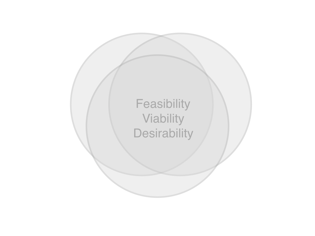
Cross-disciplinary teams see a bigger sweet spot. Less rework – less dreaming up new plans for what other people will / should do. More time getting stuff done.
The diagram could look like this…

Particular research, web design, development or management roles don’t fit nicely into a particular place here. We are all in it together. Often there will be a balance of roles to represent Business, Tech and User throughout a project / release. After all, planning, designing, executing are all best thought of as team sports.
A negotiated balance of interests needs to take place within each individual team player too. No specialist should just be thinking of the business, or the user, or the feasibility.
So it’s a useful diagram when putting a team together – but also when hiring. The right combination of management and specialist skills is important. But perhaps more important is being sure that each player has the ability to collaborate effectively with others.
Getting that sweet spot in the middle of the diagram to grow, is more important than one particular person’s talent.
