I gave a talk on Meta-moments last year to a group of UX people. Went really well. Lots of smart, engaged, happy people. Then right at the end I got asked a question that nearly floored me.
“Could you use Meta-moments to persuade people to do things that aren’t good for them?”
In all the time I’d spent thinking about the importance of encouraging thoughtful moments in our users, I’d never considered this particular angle. You could, in theory, use Roadblocks, Speedbumps or Diversions (techniques I outlined in my article) to hoodwink users into doing things that aren’t in their interest. Was I leaving the door open to a kind of manipulation? One that directed thought processes? Of course, it could be misused!
I stammered a bit. Cleared my throat. In the end I had to admit that I didn’t have an answer. I asked if anyone else would like to comment. Pretty soon after, I thanked everyone for coming and wrapped things up.
On the way home (as so often happens) I began to formulate a variety of sage answers. Being encouraged to think is nearly always good for the user? Right? Perhaps though it is only good for the user if the ‘thinking experience’ is independent (i.e. if they’re not being steered on what to think about). The key is to get them to engage critically when needed. Even if this is a manipulation, steering someone into looking out for their own interests is not a terrible thing. Is it?
The beginnings of an answer at last
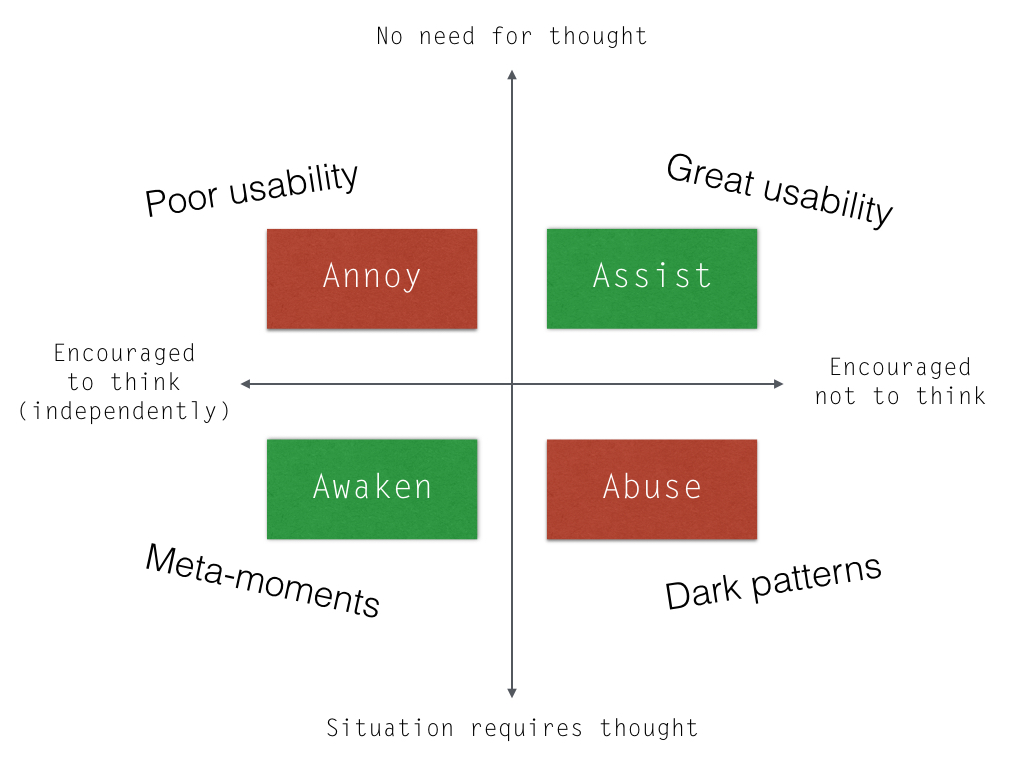
In the chart below, there are four experience types. Each begins with the letter A – (because that helps somehow). The gist is this: situations either call for independent thinking or not (or they fall on the spectrum between). When they require independent thought we should encourage it. When they don’t, we shouldn’t (“Don’t make me think (needlessly)”). Fairly simple really.

Thinking isn’t always independent
‘encouraging users to think about Y’ (where Y is a situation that requires thoughtful engagement)
I realise now, that this is not enough. You might assume that we can includes attempts to influence what users think about Y (and not just to think about Y). In other words, you might consider that this means:
'encouraging users to think X about Y'
This is a natural assumption because designers always have an agenda. For example, we want users to think well of our service or product or feature or whatever it is.
With Meta-moments though, I wanted to make a distinction. In such moments you are thinking about the shape and character of your unique experience. A sort of alertness, attentiveness or awakeness is implied. Attempts to steer this thinking dilute the focus or intensity of the moment. They either steer you away from the uniqueness of your situation or reduce your involvement, or both. Meta-moments are moments when you are encouraged to be fully involved. The designer may encourage the moment, but it’s the user’s agenda, (and not the designer’s) that is centre stage.
To design a successful *Meta-moment*, the thoughtfulness we are encouraging has to be
1. appropriate to the situation - and also
2. agenda-free, independent and critical.
Once again, it’s all about context
Let’s consider an example. Inbox by Google makes algorithmically generated suggestions to help you reply to your emails. In the screen grab below you can see three such suggestions presented in little buttons (clicking on them adds the text to your reply). It has generated the three options by reading and interpreting the contents of the email you’re responding to (as well as millions upon millions of email replies to similar looking emails).

Amazing really. You can imagine one day (in the not too distant future), not needing to hit reply at all. Our digital PA will handle writing the whole reply for us – and send it off too! It’ll only ask us to review or edit if the context demands it (i.e. if we care about the email for some reason).
And that’s the key. These suggestions are helpful (especially on mobile) if I don’t need to think too much. Say I’m responding to a friend about meeting up in the evening. Saving me a few key strokes (or thumb taps) is great in that context. But imagine I’ve just got an email from a long-lost friend. The encouragement to be less thoughtful would feel inappropriate, even if the canned response was perfect. Not an abusive or dark pattern perhaps. But far from welcome.
If we’d received an email telling us that a family member had passed away. We’d be even less likely to enjoy these recommended short cuts.1 In these contexts, we might welcome a different kind of feature. One that encourages more thoughtfulness – or a Meta-moment. You might, for example, receive a warning message if it looks like you were about to send off a hasty reply to an important email.

UX research to the rescue
This touches on the purpose of UX research. To build great experiences we must seek to understand the wider context. Building that algorithmic PA, we’d need to know:
- what help / advise is appropriate to give to our users?
- when should it be offered?
- how should it be offered?
- when can we act on their behalf? (make choices for them)
- what situations demand special treatment?
We might identify contexts within which a Meta-moment should be encouraged. For example, contexts that require:
- understanding the value of something
- taking a significant action
- preparation
- learning something new
- taking a fresh look
- interacting with a loved one
A blog piece that talked about the Smart Reply release from Google, mentions that at a certain point in the development the system was regularly suggesting “I love you” as an option. This is something that we email each other a lot, so it was identified as quite a safe bet to fall back on.
Naturally Google ruled out ’I love you’ from being a recommendation. Love has to come from us, without short-cut. We don’t want an algorithm to suggest this sort of reply.
In fact, any assisted communication with loved ones, can feel odd.

It doesn’t feel right using these shortcuts, because I care sufficiently to want personal contact. I want them to feel my DNA, even in a 3 word message. I’d rather not say anything, than say something impersonal.2
Most of us don’t want to disengage from our communications. But if we’re not careful this is exactly what is happening to us, by degree. The more and more we chatter away digitally, the less and less personal it is becoming. Products and services increasingly help people to disengage, by removing all the barriers or seams. They rarely remind people of their need to be present.
The state of User Experience Design
Let’s look at that diagram one more time – and use it to reflect on the history of User Experience Design.

Let’s take the following examples of each experience type:
- Annoying with poor usability
- Assisting with great usability
- Abusing with dark patterns
- Awakening with Meta-moments
Since the birth of the internet, User Experience Design (in some form or another) has played a critical role in moving online experiences in quadrant 1. to quadrant 2.
More recently, User Experience Design has become a reason why consumers will pick one service or product over another. Consequently, people are becoming more and more ruthless about abusive dark patterns. They vote with their feet.
Meta-moments are in their infancy. The present the opportunity to use new capabilities in Editorial Design, Interaction Design… perhaps AI Design… to be more aware and respectful of those contexts that require extra thought. Allowing this space, is never evil (as long as it is a genuine and necessary space). It is quite the opposite.

I like the diagram you ended up with, makes a lot of sense, and also helps to explain meta moments!